Portfolio

Regional Transportion District (RTD)
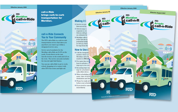
Unifying the look and feel of the expanding call-n-Ride offering from the Regional Transportation District required a broad view of the overall project. Straightline Design created a brochure design that communicates the ease of the program and devised a color palette "family" that could grow with the program as it expanded. We have completed our 16th regional version… and counting!

Comcast Corporation
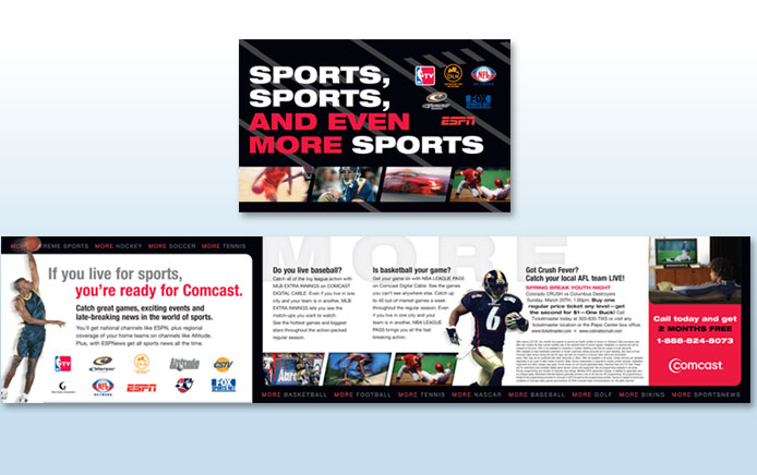
Sports, sports and more sports…you can almost feel the roar of the crowd with this action-packed direct mail piece. Straightline Design left no doubt that Comcast was the answer for the true sports fan. The exciting offer drew new customers. And Comcast declared our collaboration a winner!

Total Longterm Care
Everyday people can become extraordinary when you simply take the time to get to know them. We celebrated 12 such individuals by both focusing on expressive photos and sharing their unique stories for an inspiring look at members of the PACE (Program of All-Inclusive Care) community.

Denver Metro Convention and Visitors Bureau—83 Loop
Denver Metro Convention and Visitors Bureau, along with RTD, needed a fresh look to rebrand a Denver bus route as the ticket to tourist transport between the two most popular area shopping destinations. Our solution succeeded on all fronts. This brochure was highly functional, easy to follow and just plain fun.

Skydex Technologies
Standing out from your competitors at a trade show can be a daunting task. That's why we chose lively colors and quick hits of information for Skydex's sales handout. With easy-to-understand charts that set their product apart from the competition, Skydex was able to hit the ground running with buyers.

Sanofi Aventis
Often, developing the right visual nearly makes words almost unnecessary. Such was the case with this series of images Straightline Design developed to portray the ups and downs along with the search-and-find nature of Aventis' informative managed care guide. Coupled with a bulleted presentation of options available to employers, this insert took the right steps to increase awareness for this program.